- The Signal by RPN
- Posts
- Full Tutorial: Build a Website with AI in 15 Minutes
Full Tutorial: Build a Website with AI in 15 Minutes
From idea to published website with no coding experience
Roberto Nickson
August 12, 2025
Welcome back to The Signal, a weekly letter where I share stories, trends, strategies and insights to help you level up as an internet creator and entrepreneur.
Today we’ll be covering how to build a website in just 15 minutes using AI.
Build a Website in 15 Minutes with AI
We’re going to be building a personal website using Bolt, but there are a lot of ‘vibe coding’ tools on the market right now that let you go from prompt to fully functional website.
For beginners with no coding or design experience, I think Bolt and Lovable are the best tools. ChatGPT with the new GPT-5 update is very good as well.
For users with some technical ability, Claude Code, v0, Replit and Cursor are incredible.
If you have design skills, my favorite workflow right now is design to code with Figma Make. It’s phenomenal. We’’ll cover this in a later issue of this newsletter.
Step 1: Start with a Detailed AI Prompt
You now have the ability to make anything you want, but don’t expect to type “make good website” and get good results.
The more detailed you are with your prompt, the better.
I recommend browsing the following sites for prompt and project inspiration to see what’s possible:
My recommendation for coming up with a prompt, is to ask ChatGPT or your favorite LLM for a detailed text-to-website prompt.
For today’s example, we’ll provide as much detail (in conversational english) for what we want to build:

Here’s the prompt ChatGPT gave me.
Let’s go ahead and paste it into Bolt.
Prompt:
"Create a sleek, modern personal website with the following structure and style:

Overall Design:

Dark mode by default, with an elegant off-black (#0d0d0d) background.

Minimalist typography (Sans-serif like Inter or Space Grotesk), large headings, generous spacing, and smooth section transitions.

Rounded corners on images and cards, subtle shadows, and clean visual hierarchy.

Hero Section:

Full-width hero image at the top, featuring a high-quality portrait of me, slightly blurred background behind the portrait for depth.

My name in large, bold text, with a subtle verification checkmark icon next to it.

Below my name, small muted text with my title and location.

One-sentence tagline that captures my profession, passions, and vocation.

Link Section (Link-in-Bio Style):

Directly below the hero section, a vertical stack or grid of clickable buttons linking to my main platforms (Instagram, YouTube, X/Twitter, LinkedIn, Website, Email).

Buttons should be wide, have slightly rounded corners, and use brand colors of each platform subtly (but keep the style minimal).

Include a “copy email” and “share site” icon next to contact info.

Bio Section:

Short written bio in 2–3 sentences, giving a concise story of who I am, what I do, and what I care about.

A small accompanying image or iconography relevant to my work.

'Currently Working On' / Featured Projects Section:

Section title: “Currently Working On” in bold text.

Three large project cards displayed horizontally (or stacked on mobile).

Each card should have:

Project title in bold.

Short 1–2 sentence description.

Small thumbnail image or icon.

Action button (VIEW, READ, or WATCH).

Footer:

Small text with copyright and year.

Minimal links to Privacy Policy or other essentials.

Style Notes:

Animations should be subtle and professional (fade-ins, hover effects).

Keep everything optimized for mobile first, with fluid scaling to desktop.

Focus on visual clarity and easy navigation."
Step 2: Use the Visual Editor to Make Changes
Here’s a preview of our website.

Now, we have to make the website our own.
Let’s open up Bolt’s inspector to customize the landing page. It’s the cursor icon in the top right.
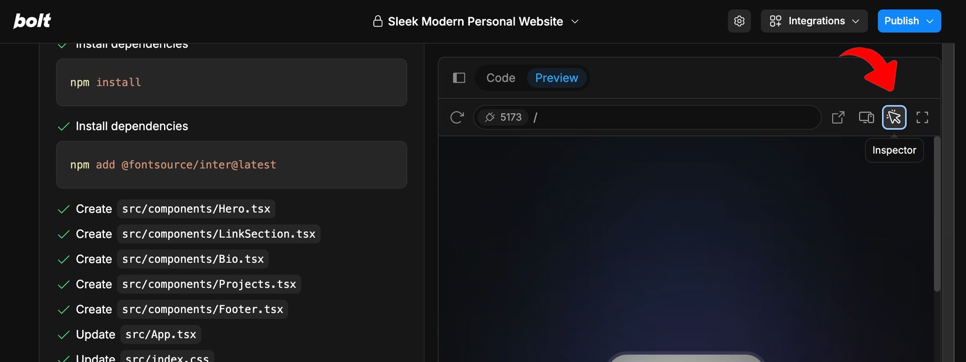
Now, you can simply click on an element and instruct Bolt (again through natural, conversational english) what changes to make.

Continue making changes until you’ve personalized the page to your liking.
As you see here, I am using the visual editor to:
Edit and replace images
Change text and modify icons
Make small design adjustments
Note: At any time, if you get stuck – no problem! Just explain your issue to Bolt, and work with it as if you were chatting with a human engineer.

Step 3: Replace Links and Other Edits in Code
Alternatively, it can be faster to make changes directly in the code.
To edit the code, select the “Code” tab.

From here, select the “search” icon to find the elements that you want to replace.

Note: If you’re more comfortable in the visual editor, stick with that. If you’re somewhat familiar with modifying code, it’s generally quicker this way – but completely optional.
Step 4: Add Improvements (Through Conversational English)
Here’s where we can add any site improvements we can think of.
A section to feature your most popular YouTube uploads? Maybe an image carousels or a map?
Hmm… how about subtle animations?
Again, we can ask ChatGPT for a prompt if needed:

Her'e’s the prompt it gave me.
Enhance this sleek, dark-mode personal link-in-bio website with elegant, subtle load animations that feel premium and refined.

Animation Style Guidelines:

Use Framer Motion or equivalent for smooth, GPU-accelerated animations.

Animation speed: 0.6s–1.2s with gentle easing (easeInOut or easeOut).

No jarring bounces—opt for slight movement + fade.

Stagger child elements so they appear in sequence for a storytelling effect.

Animation Behaviors:

Hero Section:

Background image fades in with a slow blur-to-sharp focus (1s).

Profile photo scales in from 0.95 to 1 with a fade.

Name + checkmark slide up slightly from 20px below with a fade-in.

Bio and contact buttons fade + rise in sequence (100ms stagger).

Interest Navigation Thumbnails:

Appear one-by-one from left to right, fading in and scaling from 0.9.

Add a subtle hover lift effect (translateY(-2px), shadow softening).

Social Links Row:

Fade and slide in from bottom, staggered by 80ms per icon.

Featured Project Cards:

Staggered entry from below with slight scale-up (0.97 → 1).

On hover: background darkens slightly, icon lifts 2px, shadow deepens.

Additional Polish:

Use reduced-motion media query to disable animations for accessibility.

Keep all transforms under translateY(30px) and scale(0.9–1) to avoid feeling cartoonish.

Ensure animations feel cohesive—same easing, timing curve, and opacity fade across sections.
Again, everything is done through natural language.
No CSS needed. It’s remarkable.
Our new load-in animations look great! We even have a pulsating heart icon at the bottom. It’s a great touch.

Step 5: Deploy with a Single Click
Now let’s go ahead and deploy your new website!
You can publish it in a single click by clicking “publish” in the top right.

This will give you a link to a custom domain hosted by Netlify.
Here’s the link for the page we just built so you can see an example.
In order to link it to a custom domain, you can follow the Netlify instructions here.
You can also now add integrations.
You can integration Stripe to add payments, or sync it to GitHub to import it into other tools like Cursor or Replit.

For super basic websites, like landing pages, waitlists, blogs, etc – you can now build a custom website in 15 minutes, and save money by not having to use Squarespace, Wix, etc.
Pretty damn cool. Hope you enjoyed this tutorial.

Quick Hits
This section includes things I have found interesting and helpful this week.

‣ Zach just launched Aura to the App Store! If you’re a runner, it’s the most aesthetic app to share your runs with your community.
‣ Bilawal has been covering Google’s Genie 3 launch in depth. To me, it’s one of the top 3 most impressive tech launches of the year.
‣ Cat just launched Physical Phones! It’s one of the best examples of content-product fit I have seen recently. Her marketing for it has been absolutely brilliant.
Personal Updates
My son Niam is now almost 2 months old!
Being a father to a boy has been a beautiful experience. It’s a great honor to get the chance to raise a man, and extend the Nickson lineage.
I can’t lie, 2 under 2 has been very challenging though.
Now, I’m lucky to put out a handful of pieces of content per week.
But it’s been a very deliberate slowdown. It’s something my wife and I anticipated, and welcomed with open-arms.
I should be back in full-swing by November of this year. For now, I’m enjoying this season of life and being in complete DAD MODE. Getting to spend so much time with my kids in their early years has been really the pinnacle of life experience.
I’m overwhelmed with gratitude.